A Whole New World
Sunday, July 30, 2006
Saturday, July 29, 2006
Business Card
Running club; a club's name sounds very dynamic.
The main colors here are Red, Black and White. I think the corporation of these three colors add to the clearness of the business card and somehow modern.
The way i use to arrange the contents at the bottom of the card is partly because i think it will look more dynamic than being put in the same row or column.
(>_<)
My card design
This is a card i created for introduing myself.
The main colors i use here are black, blue and a white background. The reason for this use is simply because these are my favorite colors. Moreover, i have feeling of cleaness, clearness and a bit modern with them.
Overall, i have used 2 kinds of font which are Showcard Gothic for the contents and Goudy Stout for the Logo. I think they are clear and look "active".
About the Logo, i have use the spacial font Barcode to write the word "dungism"; my favorite word. With the barcode within the Logo, i have sense of calming, maybe you think it is a bit like an item in the supermarket. However, i refer to see it as something new and special in design.
(>_<)
Sunday, July 23, 2006
Banana Bread
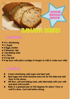 Another piece, this is based right on the subtittle of this exercise "Another Granma Repice". I do not know how, but a group of warm colors come out the top of my head. Yes, something warm, maybe peace, some thing belong to house stuffs of a small family kitchen which is orange, pink and a little yellow. But it is not all, i like to put some contrast like the star at the right top to make the paper less boring.
I hope it fit with the contents(>_<)
Essay
 This exercise is done based on the idea about old western book style. The idea is from the picture attached with the exercise, it is really impressive for me and it makes me really intertext to western book style or at least some main aspects.
Those are the balance within a page, major colors black and white, hand writing and serif fonts.
Especially, setting the picture as a background makes the essay look less empty place ( i hope it is not very hard to read if printed on A4 paper). I have used Photoshop to blur the middle area to make the text clearer as well as create a major section of the paper.
(>_<)
Saturday, July 15, 2006
Friday, July 14, 2006
Saturday, July 08, 2006
Coherence
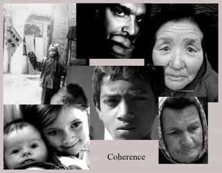
This picture is the combination of 4 different pictures from the abstraction folder on BB. They have same type of color. When we look at the picture we can see some relation between the components in style, colors, and even some meaning( Ofcourse, the meaning is not dominance, it depends on the reader) However, personally, i feel that it contains the sense of human being with war and peace...( >_< ) Give me some commment either you think i'm right or wrong;))
One way to Paradise
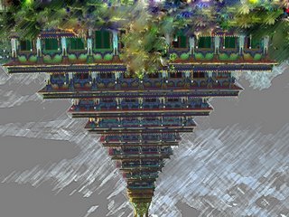
This picture is editted with many different tools in Photoshop to fit the concept of Rythm...Well, i hope it works well.
Beside creating the picture as the lesture's requirement, i also want to put some sense and feeling on it, that's what i always have interest in doing.
I have named it "One way to paradise" because i have feeling about the limitation in here (>_<),
especially when i make it rotate 180 degree, it becomes stairs to step on. And the destination is something is really far away because of the perspective. In the picture we can not see where the stairs start and where they stop, just like the way to what we usually call "Paradise".
Moreover, i have used dark colors in this to create a feeling of mysterious, grey and maybe hard (just like a human life). However, at the top, i use green and some effects which make it look stwinkling in order to open up a brand new sign. It might be the door of the "Paradise"(*-*)
My Flash
The idea of this Flash is based on Charles Sanders Peirce's theories of sign which are mentioned in the book Design for Interactive 1. For Peirce, meaning resides not in the initial perception of a sign, but in the interpretation of the perception and subsequent action based on that perception.
This idea is also taken from the Viasual Diary in DIM 1.
Sunday, July 02, 2006
Time on Rock
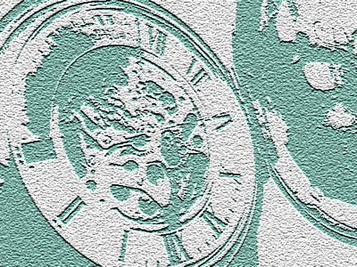
By using the filter, the mood of the picture has changed mostly in term as color as well as the smoothness of the object.
In the original picture, the main colors are white and golden which express the feeling of something "high class". In this editted one, the feeling is totally different, the object becomes more "natural"(has more green and grey of rock), it looks like being carved on the rock, solid and standing still.
Also, the meaning has changed, i guess. For the original one, we look at it and realize that it is simply pocketwatch, or much more is a sense of time. In the second one, personally, i think the meaning become conflicting. A watch (or time) is something never stops, while Rock is stable and still. So that, it makes me feel like time is stopping here...
Further more, once, we decide to think about something, we find there is so much more about it. Myself while looking at this picture, there are really many things happen in my mind.(nature, time, history, human rules...). Contact me if you have any question or comment( >_< )
Saturday, July 01, 2006
Fearness
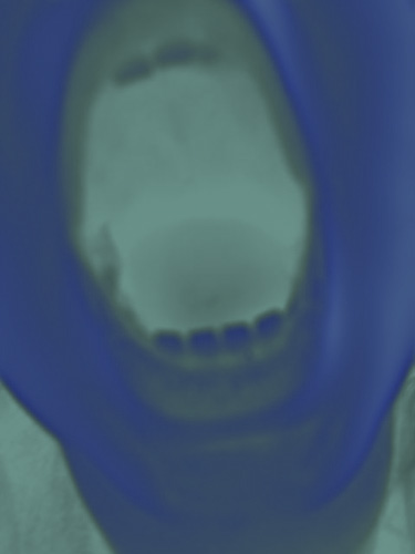
The feeling of Fear...
...getting away from where i belong to...
...the Pain is all around...
Those are the three main mood which i feel from this image for the first time seeing. Especially, after using filter to edit this image like this, my feeling getting strongger, and i feel the fearness inside me growing up.
The color in the picture makes me intertext to the feeling of being in the Hospital (it is look like the X-grey film) where makes most people feel scared(i think). I have tried many other filters, but i think this is the best way to express the mood. Blue and Green in this picture are no longer hope or pure as general meaning but sickness and scareness.
Also, the image of the open mouth makes me think that this person is yelling out lound because of being afraid of something in there. The Open Mouth (like in this picture) also a presentation of something terrible, at least for me. I feeling like there is a deep hole, in which there is no escape, no hope...
Plagiarism Poster_My artwork.
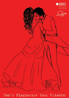
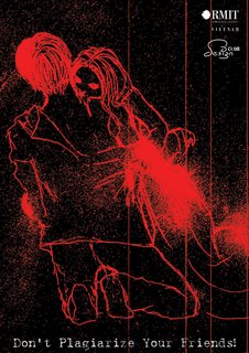 These two Poster are the artworks of Luong Tu Dung (myself) and directed and editted by Dang Son Lam.
They are all about Plagiarism, we got an idea about express the sense of Plagiarism via Image which is using the most scary story_Vampire. Then, i have drawn 2 pictures, one is showing a girl is sucking a boy's blood, another one is about a boy sucking the girl's blood. The term of "sucking blood" here is presenting for "plagiarizing". Because, we think, when somebody plagiarizing the other, it is same with he or she sucking blood or stealing grey matter of the other.
To create a sense of impression and a bit scary, the red and black color were chosen as main color system in these art works. At my point,. i think the one with the Red background is less impressing, in order words, making weaker feeling than the one with the black background. for the second one, the are some point that i think make it more attractive, the first point is the red color playing the role of blood splashing (strong feelings i think), and the lines crossing over the picture making some sense of "oldness".


