Essay
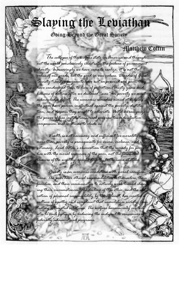 This exercise is done based on the idea about old western book style. The idea is from the picture attached with the exercise, it is really impressive for me and it makes me really intertext to western book style or at least some main aspects.
Those are the balance within a page, major colors black and white, hand writing and serif fonts.
Especially, setting the picture as a background makes the essay look less empty place ( i hope it is not very hard to read if printed on A4 paper). I have used Photoshop to blur the middle area to make the text clearer as well as create a major section of the paper.
(>_<)
posted by Luong Tu Dung @ 8:08 AM
![]()

1 Comments:
This is extremely hard to read. Not only do you have your entire body text in a script font, which is a "no-no", but its over a busy background.
No one would want to squint to read that. The font that you chose for the heading is great. You can keep that. Think about putting a box around the body text and making the background of that box white. You need to give your readers a space to rest.
The location of the author's name is just kind of just floating where it is. It does not feel attached to the rest of the image. Where could you position it so that its better.
Post a Comment
<< Home