A Whole New World

Sunday, September 03, 2006

Book Cover

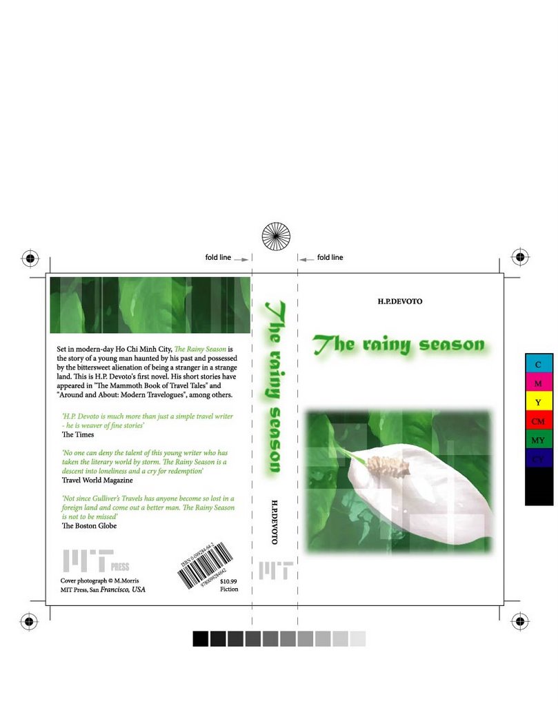
This is a bookcover i made for my assignment 3B.
The major mood of this design is "Fresh".
The barcode is arrange 45 degree to the normal position.
Main color is Green.
The front cover is simple.
(>_<)

Hoop of Colors

Hello Illustrator!!!
That's really a cool tool for me to create my own work in the computer.
See above, another design of mine made in Illustrator whose name is "Hoop of colors". For me, our life is full of colors, everything, everytime and everywhere, colors are seen. It is all around us like a hoop surrounding the universal.
(>_<)
What i have used to create this is again prush; my favorite tool and normal pencil with different filling styles.

Saturday, September 02, 2006

Cartoon style in Flash


These two image i have created in Illustrator as 2 screenshot for my final Flash project. It is all about cartoon style, light colors and fun mood.
There is one thing interesting while making these images is that when i try to fill the shape with color, the Illustrator did not allow me to do that. I did not know why, then, i decided to use the prush tool (my favorite tool) to fill the shape manualy. And, wow, i think filling colors this way is much better than the normal one that is by tool.
(>_<)

Sunday, August 27, 2006

Illustrator artworks(>_<)!!!


This is the combination of the two main background i made in Illustrator for my Flash Assignment.
For these two pictures, i only use prush to draw and fill colors. In order to make the contrast between the drawing and the background, i have chosen the dark background which is made in gray and special "pencil effect" from Photoshop.
The fonts were used are not very popular, i have it from a CD of more than 1000 intersting extra fonts. They look just fantastic for me because i think it appropriate with the topic and dynamic.
(>_<)

Book You Shuold Look At!!!


This is an "ever amazing" book i am sure. If you are a design student, you should not get rid of this book. There are various types of artwork shown in this book made by famous artists in the world. In this, you can find your favorite style from paintings, statuses, installation arts.etc..

By looking this book, you will have a chance to explore the other artist's creative products as well as enlarge your creativity. It is special right at the book cover, see above the photograph i have taken.

This book is available in the ILC of RMIT(>_<)

Tuesday, August 22, 2006

Football Club Poster


This is the poster i've designed for the Football Club. The mood of this poster is mainly fun. According to the club's leader, he want me to make something dynamic, fun and a bit "cartoon" in the poster. So, i've decided to use illustrator to draw cartoon pics there.
Main colors are green of the field and white- can be clear seen on the background.
Cartoon characters look like running around on the poster make create the sense of dynamic and having fun.
The font used is san-serif, simble and loyal.
(>_<)

Sunday, August 20, 2006

More is more


"Less is more" maybe right in many cases in desiging. However, at my point of view, for a design, the more i make it look complicated and busy the more effective i guess. I think it is not that everytime, "less" can be "more".
I get really confused in deciding each of my work whether i should make it more or less because i feel short of "uncomfortable" if there is some empty place on my paper or design.
(>_<)
Above is one of the stuffs i made recently, not very much, each small element picture is from my mobile background. I made this because i just felt that they would look better than standing alone. Each picture has its own mood but i think that putting together has created a brand new mood for each element as well as the whole one.
There is one think i invole when i arrange these pics together is in term of color. I have put them as one cool, one hot...Uhm...,how to say this. Altogether, the two standing close to each other much have different color moods(>_<)

Sunday, July 30, 2006

Another Card


Again, another version of my own card with the orchid image on it.
I have used black, white and Red as main colors, mainly because i feel come kind of chinese style in the image. This also add to the use of hand written font.
Nothing much here(>_<)

Saturday, July 29, 2006

Business Card


Running club; a club's name sounds very dynamic.
The main colors here are Red, Black and White. I think the corporation of these three colors add to the clearness of the business card and somehow modern.
The way i use to arrange the contents at the bottom of the card is partly because i think it will look more dynamic than being put in the same row or column.
(>_<)

My card design

This is a card i created for introduing myself.
The main colors i use here are black, blue and a white background. The reason for this use is simply because these are my favorite colors. Moreover, i have feeling of cleaness, clearness and a bit modern with them.
Overall, i have used 2 kinds of font which are Showcard Gothic for the contents and Goudy Stout for the Logo. I think they are clear and look "active".
About the Logo, i have use the spacial font Barcode to write the word "dungism"; my favorite word. With the barcode within the Logo, i have sense of calming, maybe you think it is a bit like an item in the supermarket. However, i refer to see it as something new and special in design.
(>_<)